


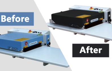
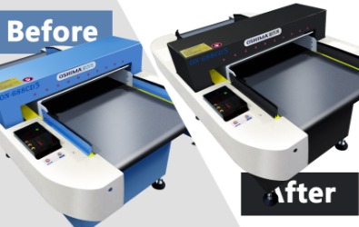
Since the start of the current year, Oshima products have undergone a renovation process, whereby customers are now provided with the option to select their preferred colors during a transitional phase. Moving forward, Oshima intends to enhance the aesthetic appeal of its products by introducing a sleek black color scheme, symbolizing the brand's confidence, enigma, and reliability.
The new Oshima hue is a representation of strength, mystery, and modernity as we go into the Internet of Things (IoT) and automation era.
With the advent of the Internet of Things (IoT) and automation, the recently introduced Oshima colors embody a sense of potency, enigma, and contemporary style. The color black is a striking and attention-grabbing hue that conveys a strong visual impression of gravity and authority. The introduction of this new product color signifies Oshima's assurance and daring strategy towards the future.
The Oshima brand logo comprises a blend of orange, yellow, and blue hues, which represent the brand's ethos and aesthetic, namely, dependability, security, optimism, and energy. From its inception, Oshima has consistently utilized blue as the predominant hue for all of its product offerings. The color blue is often regarded as a preferred option due to its association with reliability, safety, and trustworthiness. For a period of fifty years, the emblem of Oshima's brand has consistently embodied its dependability and the confidence of its clientele in its merchandise.
The facelift is a strategic move by Oshima to enhance its brand image, effectively highlighting the brand's fundamental principles while maintaining a harmonious balance between its extensive technical expertise and capabilities for long-term growth. Oshima is committed to pursuing innovation and enhancing the quality and reliability of our products and services to better serve our customers.
